
Day 3: Overview
Flexbox (Flexible Box Layout) is a modern CSS layout system that makes it easy to align and distribute items in a container. Before Flexbox, creating layouts required complex float and positioning hacks. Today, you'll learn how to use Flexbox to create professional, responsive layouts with ease.
Learning Objectives
By the end of this tutorial, you will:
- Understand the Flexbox container and item model
- Master alignment and distribution with justify-content and align-items
- Create responsive navigation bars
- Build multi-column layouts
- Understand when to use flex-grow, flex-shrink, and flex-basis
Part 1: Understanding Flexbox
The Flex Container and Flex Items
Flexbox works with two types of elements:
- Flex Container - The parent element with
display: flex - Flex Items - The direct children of the flex container
<div class="container"> <!-- Flex Container -->
<div>Item 1</div> <!-- Flex Item -->
<div>Item 2</div> <!-- Flex Item -->
<div>Item 3</div> <!-- Flex Item -->
</div>
.container {
display: flex; /* This makes it a flex container */
}
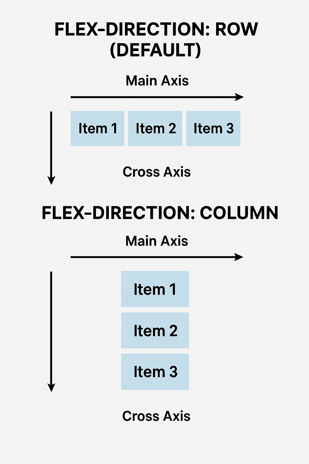
The Main Axis and Cross Axis
Flexbox operates on two axes:
Part 2: Container Properties
display: flex
.container {
display: flex; /* Creates flex container */
}
flex-direction
Controls the main axis direction.
.container {
display: flex;
flex-direction: row; /* Default: items in a row → */
flex-direction: row-reverse; /* Right to left ← */
flex-direction: column; /* Items in a column ↓ */
flex-direction: column-reverse; /* Bottom to top ↑ */
}
Example:
<div class="row-container">
<div>1</div>
<div>2</div>
<div>3</div>
</div>
.row-container {
display: flex;
flex-direction: row; /* 1 2 3 in a horizontal row */
}
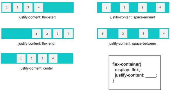
justify-content
Aligns items along the main axis.
.container {
display: flex;
justify-content: flex-start; /* |123 | (default) */
justify-content: flex-end; /* | 123| */
justify-content: center; /* | 123 | */
justify-content: space-between; /* |1 2 3| */
justify-content: space-around; /* | 1 2 3 | */
justify-content: space-evenly; /* | 1 2 3 | */
}
Visual Guide:
align-items
Aligns items along the cross axis.
.container {
display: flex;
height: 300px; /* Need height to see vertical alignment */
align-items: stretch; /* Default: items stretch to fill */
align-items: flex-start; /* Align to top */
align-items: flex-end; /* Align to bottom */
align-items: center; /* Center vertically */
align-items: baseline; /* Align text baselines */
}
flex-wrap
Controls whether items wrap to new lines.
.container {
display: flex;
flex-wrap: nowrap; /* Default: all items on one line */
flex-wrap: wrap; /* Items wrap to new lines */
flex-wrap: wrap-reverse; /* Items wrap in reverse order */
}
gap
Adds spacing between flex items (modern property).
.container {
display: flex;
gap: 20px; /* 20px gap between all items */
gap: 20px 40px; /* 20px vertical, 40px horizontal */
/* Older alternative: */
column-gap: 20px;
row-gap: 20px;
}
Part 3: Item Properties
flex-grow
Controls how much an item grows relative to other items.
.item1 {
flex-grow: 1; /* Takes 1 part of extra space */
}
.item2 {
flex-grow: 2; /* Takes 2 parts of extra space (twice as much) */
}
.item3 {
flex-grow: 1; /* Takes 1 part of extra space */
}
/* If container has 400px extra space:
Item1: 100px, Item2: 200px, Item3: 100px */
flex-shrink
Controls how much an item shrinks when space is limited.
.item {
flex-shrink: 1; /* Default: can shrink */
flex-shrink: 0; /* Won't shrink */
flex-shrink: 2; /* Shrinks twice as fast */
}
flex-basis
Sets the initial size of an item before growing/shrinking.
.item {
flex-basis: 200px; /* Start at 200px wide */
flex-basis: 30%; /* Start at 30% of container */
flex-basis: auto; /* Default: based on content */
}
flex Shorthand
/* flex: [grow] [shrink] [basis] */
.item {
flex: 1; /* flex: 1 1 0 - grow equally */
flex: 0 0 200px; /* Don't grow/shrink, fixed 200px */
flex: 2 1 auto; /* Grow 2x, shrink normally */
}
/* Common patterns: */
.equal-width {
flex: 1; /* All items equal width */
}
.fixed-sidebar {
flex: 0 0 250px; /* Fixed 250px sidebar */
}
.flexible-content {
flex: 1; /* Takes remaining space */
}
align-self
Overrides align-items for a specific item.
.container {
display: flex;
align-items: center; /* All items centered */
}
.special-item {
align-self: flex-end; /* This one aligns to bottom */
}
Part 4: Building a Responsive Navbar
Basic Navbar Structure
<nav class="navbar">
<div class="nav-brand">
<h1>MyWebsite</h1>
</div>
<ul class="nav-menu">
<li><a href="#home">Home</a></li>
<li><a href="#about">About</a></li>
<li><a href="#services">Services</a></li>
<li><a href="#contact">Contact</a></li>
</ul>
</nav>
Navbar CSS with Flexbox
/* Navbar container */
.navbar {
display: flex;
justify-content: space-between;
align-items: center;
background: #333;
padding: 1rem 2rem;
box-shadow: 0 2px 5px rgba(0,0,0,0.1);
}
/* Brand/Logo */
.nav-brand h1 {
color: white;
font-size: 24px;
margin: 0;
}
/* Menu list */
.nav-menu {
display: flex;
list-style: none;
gap: 2rem;
margin: 0;
padding: 0;
}
.nav-menu li {
margin: 0;
}
.nav-menu a {
color: white;
text-decoration: none;
font-size: 16px;
padding: 0.5rem 1rem;
transition: background 0.3s;
border-radius: 4px;
}
.nav-menu a:hover {
background: #555;
}
Responsive Navbar (Mobile-Friendly)
/* Mobile styles */
@media (max-width: 768px) {
.navbar {
flex-direction: column;
align-items: stretch;
}
.nav-brand {
text-align: center;
margin-bottom: 1rem;
}
.nav-menu {
flex-direction: column;
gap: 0;
}
.nav-menu a {
display: block;
padding: 1rem;
border-top: 1px solid #444;
}
}
Part 5: Sidebar + Content Layout
The Classic Two-Column Layout
<div class="layout">
<aside class="sidebar">
<h2>Sidebar</h2>
<ul>
<li>Link 1</li>
<li>Link 2</li>
<li>Link 3</li>
</ul>
</aside>
<main class="content">
<h1>Main Content</h1>
<p>This is the main content area...</p>
</main>
</div>
Flexbox Layout CSS
.layout {
display: flex;
gap: 20px;
min-height: 100vh;
}
.sidebar {
flex: 0 0 250px; /* Fixed width sidebar: 250px */
background: #f4f4f4;
padding: 20px;
}
.content {
flex: 1; /* Takes remaining space */
padding: 20px;
}
/* Responsive: Stack on mobile */
@media (max-width: 768px) {
.layout {
flex-direction: column;
}
.sidebar {
flex: 1; /* Full width on mobile */
}
}
Part 6: Practical Examples
Example 1: Centered Content (Horizontal and Vertical)
<div class="center-box">
<div class="content">
<h1>Perfectly Centered</h1>
<p>Both horizontally and vertically!</p>
</div>
</div>
.center-box {
display: flex;
justify-content: center; /* Center horizontally */
align-items: center; /* Center vertically */
min-height: 100vh;
background: linear-gradient(135deg, #667eea 0%, #764ba2 100%);
}
.content {
text-align: center;
color: white;
}
Example 2: Card Grid
<div class="card-container">
<div class="card">Card 1</div>
<div class="card">Card 2</div>
<div class="card">Card 3</div>
<div class="card">Card 4</div>
<div class="card">Card 5</div>
<div class="card">Card 6</div>
</div>
.card-container {
display: flex;
flex-wrap: wrap;
gap: 20px;
padding: 20px;
}
.card {
flex: 1 1 300px; /* Grow, shrink, min-width 300px */
background: white;
padding: 20px;
border-radius: 8px;
box-shadow: 0 2px 10px rgba(0,0,0,0.1);
min-height: 200px;
}
Example 3: Sticky Footer Layout
<div class="page-container">
<header>Header</header>
<main>Content (can be short or long)</main>
<footer>Footer always at bottom</footer>
</div>
.page-container {
display: flex;
flex-direction: column;
min-height: 100vh;
}
header {
background: #333;
color: white;
padding: 20px;
}
main {
flex: 1; /* Takes all available space */
padding: 20px;
}
footer {
background: #333;
color: white;
padding: 20px;
text-align: center;
}
Part 7: Building Your Responsive Navbar Project
Let's build a complete, professional navbar from scratch.
Step 1: Create the HTML
<!DOCTYPE html>
<html lang="en">
<head>
<meta charset="UTF-8">
<meta name="viewport" content="width=device-width, initial-scale=1.0">
<title>Flexbox Navbar</title>
<link rel="stylesheet" href="styles.css">
</head>
<body>
<nav class="navbar">
<div class="nav-container">
<div class="nav-brand">
<h1>DevPortfolio</h1>
</div>
<ul class="nav-menu">
<li class="nav-item"><a href="#home" class="nav-link">Home</a></li>
<li class="nav-item"><a href="#about" class="nav-link">About</a></li>
<li class="nav-item"><a href="#projects" class="nav-link">Projects</a></li>
<li class="nav-item"><a href="#skills" class="nav-link">Skills</a></li>
<li class="nav-item"><a href="#contact" class="nav-link">Contact</a></li>
</ul>
</div>
</nav>
<div class="hero">
<h1>Welcome to My Portfolio</h1>
<p>Building amazing web experiences with modern technologies</p>
</div>
<div class="layout-demo">
<aside class="sidebar">
<h2>Quick Links</h2>
<ul>
<li><a href="#">Dashboard</a></li>
<li><a href="#">Profile</a></li>
<li><a href="#">Settings</a></li>
<li><a href="#">Help</a></li>
</ul>
</aside>
<main class="main-content">
<h2>Main Content Area</h2>
<p>This layout uses Flexbox to create a responsive sidebar and main content area.</p>
<p>Resize your browser window to see how it adapts to different screen sizes!</p>
</main>
</div>
</body>
</html>
Step 2: Create the CSS
/* Reset and base styles */
* {
margin: 0;
padding: 0;
box-sizing: border-box;
}
body {
font-family: 'Segoe UI', Tahoma, Geneva, Verdana, sans-serif;
line-height: 1.6;
}
/* Navbar styles */
.navbar {
background: linear-gradient(135deg, #667eea 0%, #764ba2 100%);
box-shadow: 0 2px 10px rgba(0,0,0,0.1);
position: sticky;
top: 0;
z-index: 100;
}
.nav-container {
display: flex;
justify-content: space-between;
align-items: center;
max-width: 1200px;
margin: 0 auto;
padding: 1rem 2rem;
}
.nav-brand h1 {
color: white;
font-size: 28px;
font-weight: 700;
}
.nav-menu {
display: flex;
list-style: none;
gap: 0.5rem;
}
.nav-link {
color: white;
text-decoration: none;
padding: 0.75rem 1.25rem;
border-radius: 6px;
transition: all 0.3s ease;
font-weight: 500;
}
.nav-link:hover {
background: rgba(255, 255, 255, 0.2);
transform: translateY(-2px);
}
/* Hero section */
.hero {
display: flex;
flex-direction: column;
justify-content: center;
align-items: center;
min-height: 400px;
background: linear-gradient(135deg, #667eea 0%, #764ba2 100%);
color: white;
text-align: center;
padding: 2rem;
}
.hero h1 {
font-size: 48px;
margin-bottom: 1rem;
}
.hero p {
font-size: 20px;
opacity: 0.9;
}
/* Layout demo */
.layout-demo {
display: flex;
gap: 2rem;
max-width: 1200px;
margin: 2rem auto;
padding: 0 2rem;
}
.sidebar {
flex: 0 0 250px;
background: #f8f9fa;
padding: 2rem;
border-radius: 10px;
}
.sidebar h2 {
color: #333;
margin-bottom: 1rem;
}
.sidebar ul {
list-style: none;
}
.sidebar li {
margin-bottom: 0.75rem;
}
.sidebar a {
color: #667eea;
text-decoration: none;
font-weight: 500;
transition: color 0.3s;
}
.sidebar a:hover {
color: #764ba2;
}
.main-content {
flex: 1;
background: white;
padding: 2rem;
border-radius: 10px;
box-shadow: 0 2px 10px rgba(0,0,0,0.05);
}
.main-content h2 {
color: #333;
margin-bottom: 1rem;
}
.main-content p {
color: #666;
margin-bottom: 1rem;
}
/* Responsive design */
@media (max-width: 768px) {
.nav-container {
flex-direction: column;
gap: 1rem;
}
.nav-menu {
flex-direction: column;
width: 100%;
gap: 0;
}
.nav-link {
display: block;
text-align: center;
border-bottom: 1px solid rgba(255,255,255,0.1);
}
.hero h1 {
font-size: 32px;
}
.hero p {
font-size: 16px;
}
.layout-demo {
flex-direction: column;
}
.sidebar {
flex: 1;
}
}
@media (max-width: 480px) {
.nav-container {
padding: 1rem;
}
.hero {
min-height: 300px;
}
.hero h1 {
font-size: 24px;
}
.layout-demo {
padding: 0 1rem;
}
}
Common Flexbox Patterns
Pattern 1: Equal Width Columns
.container {
display: flex;
}
.column {
flex: 1; /* All columns equal width */
}
Pattern 2: Fixed Sidebar + Flexible Content
.layout {
display: flex;
}
.sidebar {
flex: 0 0 300px; /* Fixed 300px */
}
.content {
flex: 1; /* Takes remaining space */
}
Pattern 3: Center Everything
.container {
display: flex;
justify-content: center;
align-items: center;
min-height: 100vh;
}
Pattern 4: Space Between Items
.container {
display: flex;
justify-content: space-between;
}
Flexbox vs Other Layout Methods
| Feature | Flexbox | Float | Grid |
|---|---|---|---|
| One-dimensional | ✅ | ⚠️ | ❌ (2D) |
| Easy alignment | ✅ | ❌ | ✅ |
| Order control | ✅ | ❌ | ✅ |
| Dynamic sizing | ✅ | ❌ | ✅ |
| Browser support | ✅ | ✅ | ✅ |
When to use Flexbox:
- Navbar menus
- Card layouts
- Centering elements
- List items
- Form layouts
- Sidebar layouts
When to use Grid (Day 4's topic):
- Complex page layouts
- Photo galleries
- Dashboard layouts
- Magazine-style layouts
Challenge Exercises
- Create a footer with three columns (copyright, links, social media) that stacks on mobile
- Build a pricing table with three cards that are equal height and wrap on mobile
- Make a photo gallery with flex-wrap that adjusts the number of columns based on screen width
- Create a "holy grail" layout with header, navbar, sidebar, main content, and footer
- Build a testimonial slider layout with centered text and images
Common Mistakes to Avoid
- Forgetting display: flex - Nothing works without it
- Confusing main axis and cross axis - Remember flex-direction determines this
- Using wrong alignment property - justify-content for main axis, align-items for cross axis
- Not considering flex-wrap - Items might overflow without it
- Overcomplicating with flex shorthand - Start with individual properties until comfortable
Key Takeaways
- Flexbox makes one-dimensional layouts easy
justify-contentaligns along the main axisalign-itemsaligns along the cross axisflex: 1makes items grow equally- Flexbox is perfect for navigation bars and card layouts
- Always consider mobile-first responsive design
Next Steps
Tomorrow, we'll dive deeper into responsive design with media queries, learn about relative units (%, vh, vw), and create a fully responsive profile page that looks great on all devices. You'll also learn mobile-first vs desktop-first approaches and create a collapsible navigation menu.
Preview of Day 4: You'll make your profile page look perfect on phones, tablets, and desktops using responsive design principles!
GlenH - Dec 2, 2025gghayoge at gmail.com